An example of how we process students' responses to get pre-post changes...
One key aspect of the E-CLASS survey is being able to look at how much laboratory courses shifted students attitudes over the course of a semester. There are many ways to visualize such a shift, but one of the easiest is shown in Fig. 1 on the Report page. This section goes over how students' responses are processed to make such a plot and to explain what it means.
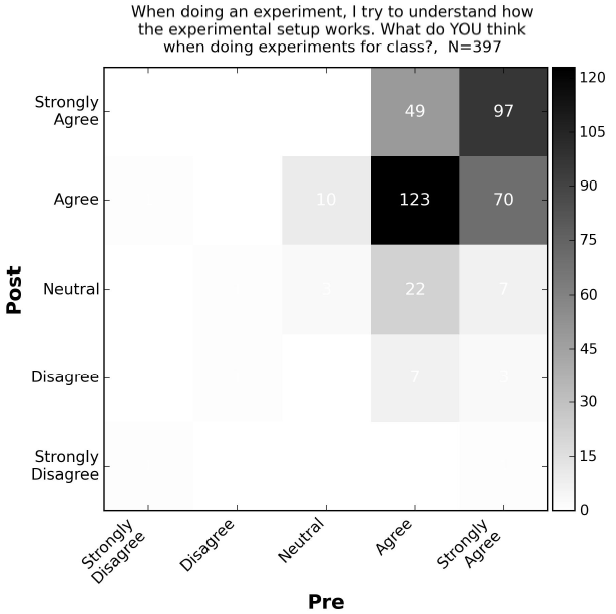
First, we restrict our analysis to the subset of students who completed both the pre and post surveys. Figure 2 represents these data as a 2D histogram, which shows the number of students in your class who fell in to each possible paired (pre, post) response.
FIGURE 13. A 2D histogram showing the number of students with each possible pair of pre and post responses.
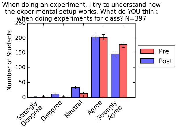
We can reduce the amount of data to visualize by comparing side-by-side histograms of the pre and post distributions. This amounts to summing up along the rows to get the post distribution, and summing up along the columns to get the pre distribution.
FIGURE 14. A histogram showing the distribution of students responses on the pre and post surveys.
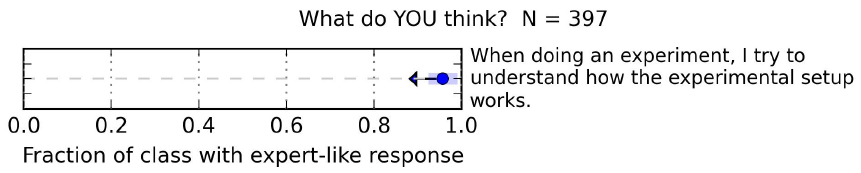
We can further simplify the data representation by reducing the distribution in Fig. 14 to a single number - the fraction of the class with an expert-like response, as is shown in Fig. 15. In Fig. 15, the circle shows the fraction of the class with an expert-like response to the statement (i.e., "Disagree" or "Strongly Disagree") on the pre-survey . The arrow in Fig. 4 shows the shift between the pre- and post-survey. The shaded bar shows a 95% likelihood interval. Given the observed distribution of pre-responses, we would expect the expert-like fraction to lie within that band 95% of the time. The larger the arrow is compared to the shaded bar, the less likely the change could have occured by chance.
FIGURE 15. A simple representation of the change in students' attitudes during the semester. The circle shows the pre-survey values. The arrow indicates the pre to post change. The shaded bar indicates a 95% confidence interval.